-
 80 Parramatta Road, Underwood, Qld, 4119
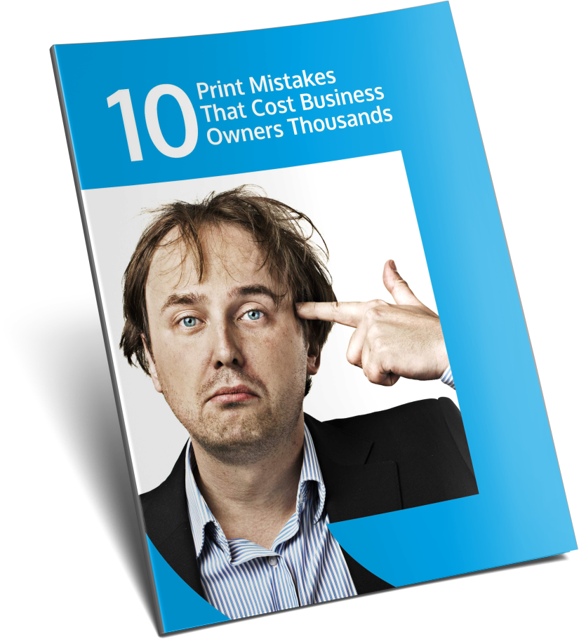
So you’re investing in print marketing for your business – Great! Let’s make sure you get it right the first time. This guide takes you through 10 of the most common mistakes we’ve seen aspiring business owners make, often because they’re unaware of simple tips which can save them thousands of dollars in lost revenue.
====================================================================
1. It’s not about you – it’s the problem you solve for your customers
You might be the best in the world at your chosen profession, but the fact is, when it comes to marketing, it’s not about you….It’s about the problem you solve for your ideal customers. Your prospects respond to what’s in it for them, the benefits that will improve their lives, avoid pain or make their life easier.
The faster you can get people to understand how you can help them, the better. You can always use your credentials, 3rd party endorsements or testimonials, guarantees and social proof to support your sales message….but identify the problem you solve first.
Let’s take the example of a flyer for a real estate agent to try and get more listings. It could include a recipe, picture of a recent sale or a chest beating picture of the agent asking for your listing. These brand awareness offerings may help to support credibility, but are unlikely to get someone to take action. Put yourself in the shoes of someone actually thinking of selling their house. What do they want?
How about you offer them access to a guide that shows them ‘How to massively increase their home value with little cost or effort’, or a mini case study on ‘How you helped a local home owner secure $129,750 more than the listing price’ for a recent sale. Consider the triggers most likely to get your ideal customers to take action.
====================================================================
2.Busy, Busy, Busy
Have you ever looked at a printed flyer and thought ‘wow that’s soooo busy, I don’t know where to start’….which was most likely followed up with you screwing it up and throwing it in the bin.
We all face thousands of distractions everyday and the last thing you want to do is create more information overload in amongst all the other clutter.
Beware of too many colours or images, too many fonts, too much information stacked all together, disorder, complexity, too small text all jam packed into the page…the list goes on.
So how do you create a design that’s simple, gets attention and gets results. It starts with getting clear about what it is you want the design to do… Let customers know about an upcoming event, what’s on special this week, whatever the specific thing is you want people to take away from reading your design.
Make sure this ‘one big thing’ is clearly communicated above all else. If you need to support the message ‘list the benefits to your client in point form so they can quickly understand what’s important.
Things generally get busy when business owners try to deliver multiple messages or offers all at the same time and cram too many things in, giving the reader way too much distractions.
HOT TIP – When placing text, it’s often better to include short blocks or bullet points with headers so people can skim and pick up the important points.
====================================================================
3.Poorly Defined Offers
What are you really offering?
You’re doing the printed design for a reason…so get to the point quickly. Make sure your prospects understand exactly how they can benefit from your offer.
Let’s take an electrician for example that hands out flyers to the neighbours of all the houses they work on to try and drum up additional work. The electrician could offer a ‘FREE Electrical Inspection & Quote For The Next 14 Days’ or a ‘FREE Inspection to find out how you can save hundreds of dollars on your power bills every quarter’. These offers should be the major thing your customers see when they look at your design.
Again put yourself in the shoes of your ideal customers and let them know exactly what’s ‘s on offer to help them.
====================================================================
4.Stay on brand
Make sure your print marketing stays true to your brand.
The cold hard fact is that when you’re in business, people are judging you and your brand everyday. And your brand isn’t necessarily what you think it is…it’s what your customers think it is.
Every time your customers receive any marketing materials from you, they make decisions as to your desirability. And although they may not be in the market for your services right now, each time they see your ‘stuff’ you’re influencing their impression of you and your business.
Consistency is the key.
A selection of colours that work cohesively well together each time.
Common messaging that reinforces the benefits to your customers.
Presentation of your logo in the same style and format every time
It’s all about building credibility with each and every engagement. If you have brochures that are different to your flyers, that are different to your website and your signage, your prospects could be mistaken for thinking you take the same haphazard approach to your services.
HOT TIP – It’s valuable to develop a style guide for your brand that defines the ‘rules’ for using your logo and design elements with consistency and professionalism
====================================================================
5.No Clear call to action
One of the most commonly overlooked print mistakes is simply failing to actually ask people to do what you want them to do.
It could be a simple prompt to call today, visit your website, come into the store this weekend….whatever it is – but be sure to ask.
Otherwise you could be leaving thousands on the table, simply because your prospects haven’t been invited to take action.
HOT TIP – You can even add urgency to give them a ‘nudge’ with limited time deals, free trials for the next month, exclusive coupons for the next 14 days -whatever it takes to get them to take action now rather than putting it off until later.
====================================================================
6.Borders, bleed and no white space
Have you ever noticed that some of the most powerful marketing is just incredibly simple. Like the advert below that has such a strong message with lots of space around it – no distraction. ‘White space’ can be one of your most powerful tools for getting people to take notice. It subconsciously gets people thinking ‘what’s so important that I need to pay attention to.’
You’ll also notice that when you take information too close to the edge of a design, it just looks bad and disproportionate. Always give yourself a healthy border from the edge to keep things balanced. It also pays to make sure you leave extra space for images and blocks of colour beyond the cutting edge of the design, called ‘bleed’. It ensures that your designs look great and makes the job of your printer much, much easier.
HOT TIP – It’s valuable to develop a style guide for your brand that defines the ‘rules’ for using your logo and design elements with consistency and professionalism
====================================================================
7.Too many fonts and fonts used badly
You’ve got a few messages to deliver in your marketing, but don’t get too carried away with multiple different font types and sizes. It leads to distraction and feels disorganized and unprofessional.
You can use varied scaling of the same fonts to achieve dramatic effect with hierarchy of size from largest to smallest for the most to least important information.
HOT TIP – As a reference point, work with a maximium of 3 different font types to avoid distracting the message
====================================================================
8. Avoid mismatched colours & poor contrast
You may have a great offer, but if the design is a mismatch of colours, it can really turn people off. Use the KULER tool to check out colour pallets that work together.
It’s also important to be wary of contrast or lack of it, making your messages harder to read….diluting the effectiveness of your communications.
Good colour combinations with strong contrast aid readability and secure attention.
====================================================================
9.No measuring of results & response
You’re investing in printed marketing, but how will you measure your campaign’s success? It’s an important answer to know as without it, you could find out you’re losing out on your marketing investment, or worse still….repeat underperforming campaigns that lose you money again and again.
It’s critical you establish a way to track the results of every campaign, so you can make quantified decisions on whether to scale or stop your campaigns.
Fortunately you can now set up dedicated phone numbers, specific email addresses and landing pages, and monitor sales or responses in store to understand the real impact of your print marketing.
When you measure the results, you’ll learn where your customers actually come from, what works, what doesn’t and where you really make your profits.
HOT TIP – You can add vouchers or coupon codes to your print designs to monitor how many people actually respond
====================================================================
10.Check, Check & Check Again
There’s nothing worse than circulating your print materials to your customers only to find out you’ve made a stupid mistake.
Spelling errors tarnish your credibility and irritate customers. It’s both annoying and embarrassing and it gets them asking whether you’ll deliver the same ‘shoddiness’ with your actual services.
Worse still, incorrect phone numbers, email or web addresses will literally prevent customers from doing business with you, directly affecting your return on investment.
Make sure you include everything that’s needed. Imagine having your finished flyer go out with your logo missing or the phone number not there….its a sure fire way to bleed dollars unnecessarily.
So the moral of the story is…It pays to do a triple check yourself and then share your works with other team members, friends and colleagues, ensuring they also lend a keen eye and an honest opinion.
Lastly it can add real value to get some feedback from a few of your trusted existing customers…just to make sure it hits the mark, doesn’t offend and captures their attention. You might just find they mention something you may have overlooked.
====================================================================
What Next?
NEED HELP FINDING THE MOST EFFECTIVE MARKETING MATERIAL FOR YOUR MESSAGE? CONTACT US AND ONE OF OUR PRINT SPECIALISTS WILL BE HAPPY TO HELP.
Be sure to visit www.kingswoodprint.com.au to select from a wide selection of print and promotional works that you can use to promote your business. We’ve even got proven design templates for you to work with or one of our creatives can create a masterpiece for you. ====================================================================
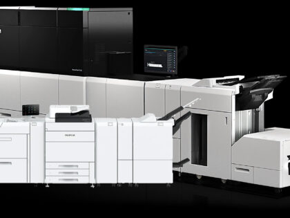
Kingswood Print and Signage Welcomes the Fuji PC1120 and EC1100 Digital Printers In the ever-evolving world of printing, innovation and quality are paramount. At Kingswood Print and Signage, we’re thrilled to announce a major leap forward in our printing capabilities with the addition of two cutting-edge Fuji Digital Printers – the PC1120 and the EC1100. […]

If you think using non-digital marketing methods in the current digitally evolved world is no...

Offset printing offers extremely high-quality and detailed printing. Offset printing...

Pull up banners and real estate signs are great ways to promote brands and businesses.
Leave a Great First Impression?. The little rectangles that you carry around in your pocket,
As a company dealing in print media and signage, we are always looking to provide the best...


